F*ck Food Waste, a D&AD Competition entry
This project was developed as part of the competition organised by the Global Association for Creative Advertising & Design (D&AD), where Google Fonts and The Hoffmitz Milken Centre for Typography (HMCT) challenged participants to create a campaign for positive social change using typography from the Google Fonts library. The objective was to promote these tools while addressing relevant social issues.
In a world increasingly concerned with sustainability, food waste stands out as both an environmental and ethical challenge. Over-purchasing and strict aesthetic standards drive the disposal of significant amounts of perfectly edible food, contributing to greenhouse gas emissions and exacerbating climate change. The "F*ck Food Waste" campaign focuses on reducing food waste by highlighting the environmental impact of discarded food and encouraging more responsible consumer behaviour in the UK.
Choosing the team

Ana Sendra
Project Coordinator
Visual Designer
UX Designer

Damian Simonovich
UX Designer
Visual Designer
Motion Designer
We’ve worked together before and have a similar problem-solving approach, enjoy learning from each other, and teamed up to bring more skills to increase our chances of winning.
Researching
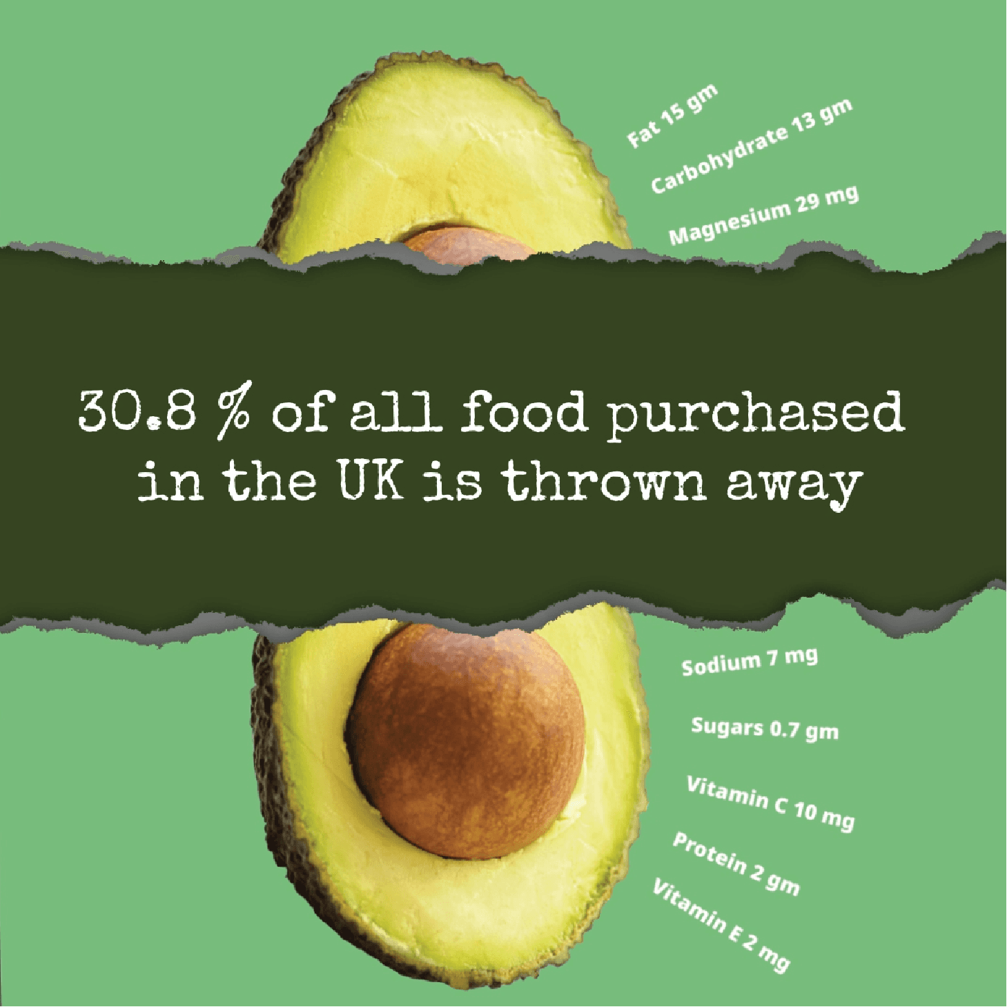
Our research revealed that societal values prioritising appearance over quality lead to substantial food waste, with up to 60% of food discarded before it even reaches consumers. On average, each person in the UK discards 70 kg of food per year. The UK alone generates 9.52 million tonnes of food waste annually, resulting in 36 million tonnes of CO₂ emissions. Despite 20% of the UK’s CO₂ emissions being tied to food production, distribution, and storage, only 32% of UK citizens recognise the connection between food waste and climate change, even though 81% express concern about environmental issues.
How might we?
To tackle the challenge of reducing food waste effectively, we conducted a thorough exploration of potential solutions through UX research. This involved framing the problem in a way that would allow us to generate creative and actionable ideas. We used several "How Might We" statements to guide our brainstorming and identify strategies that could address the issue from multiple angles.
How might we encourage consumers to leave fewer leftovers at restaurants?
How might we shift consumer focus from aesthetics to quality in food purchasing?
How might we reduce food accumulation in homes, leading to less spoilage?
How might we educate consumers on the difference between "best before" and "use by" dates?
How might we increase the purchase of "wonky" (imperfect-looking) food items?
How might we encourage consumers to buy only what they need, rather than succumbing to marketing deals?
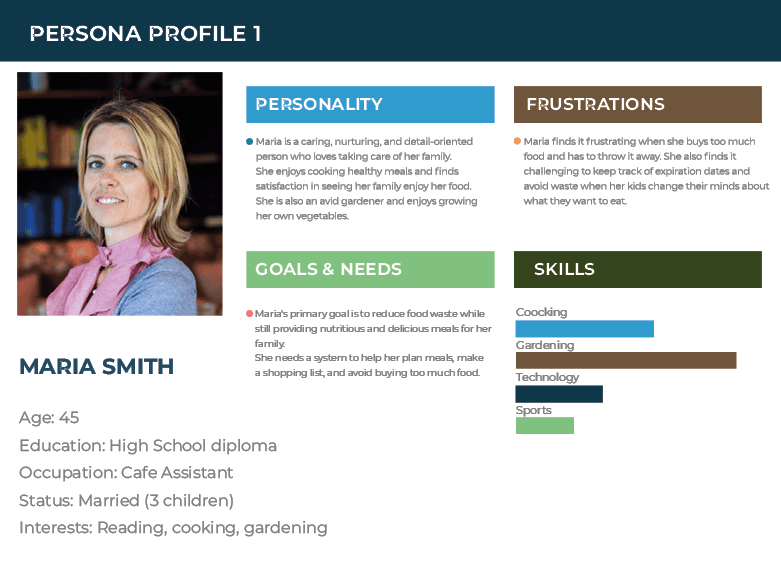
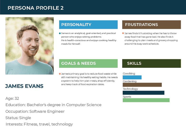
Target audience & stakeholders
Our primary target audience is consumers, as they are directly responsible for a significant portion of food waste. However, we also recognise the importance of engaging other stakeholders, such as government bodies, food producers, farmers, and retailers, in our campaign..
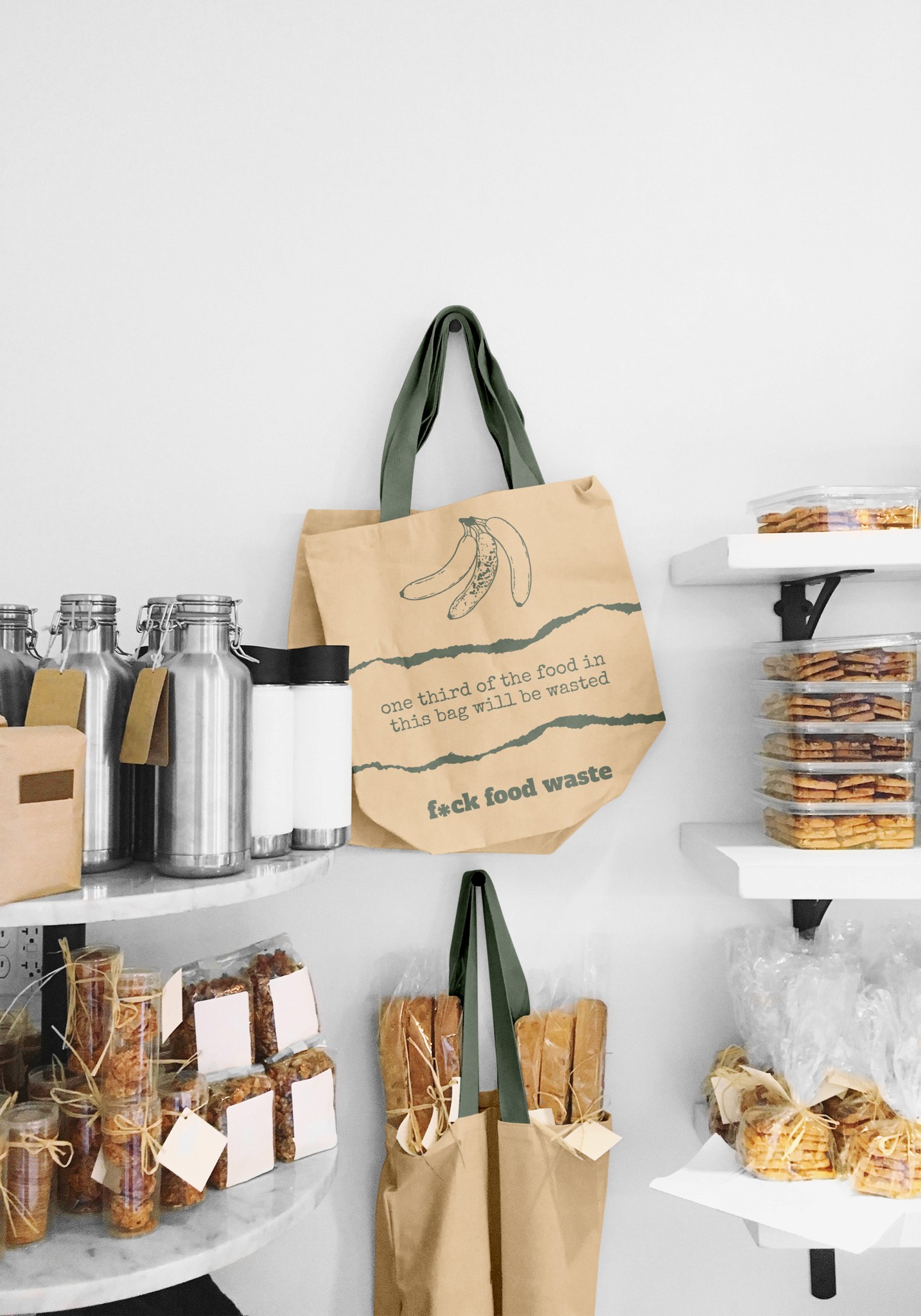
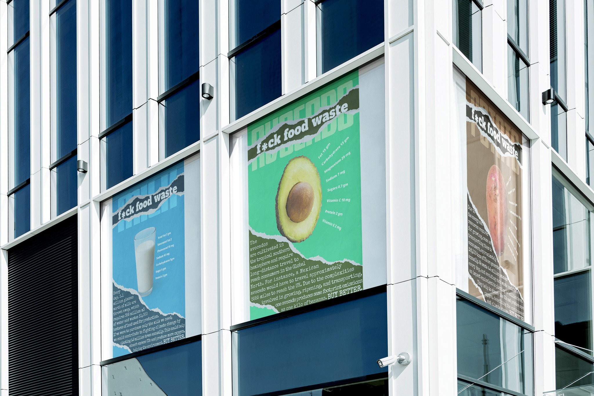
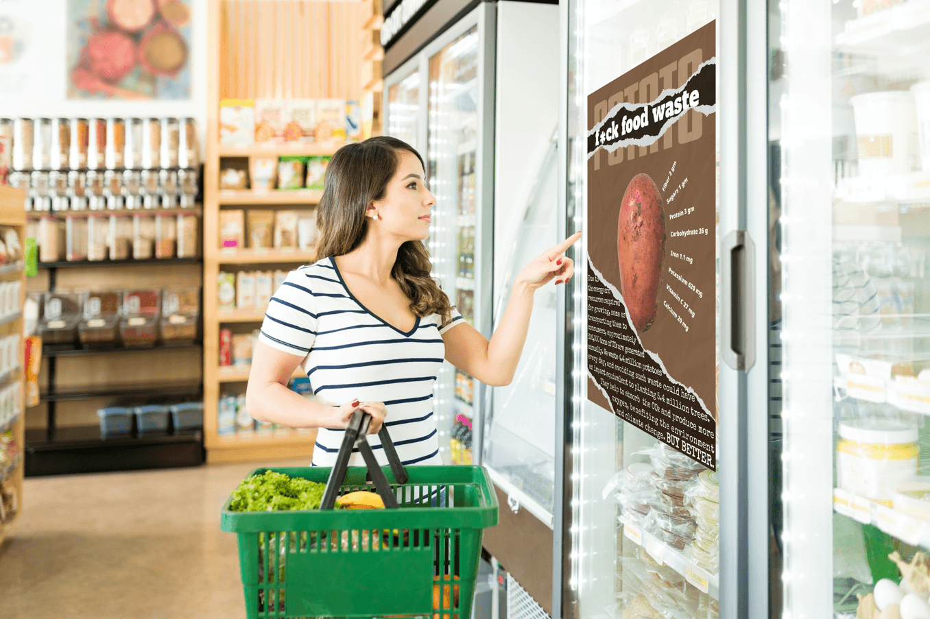
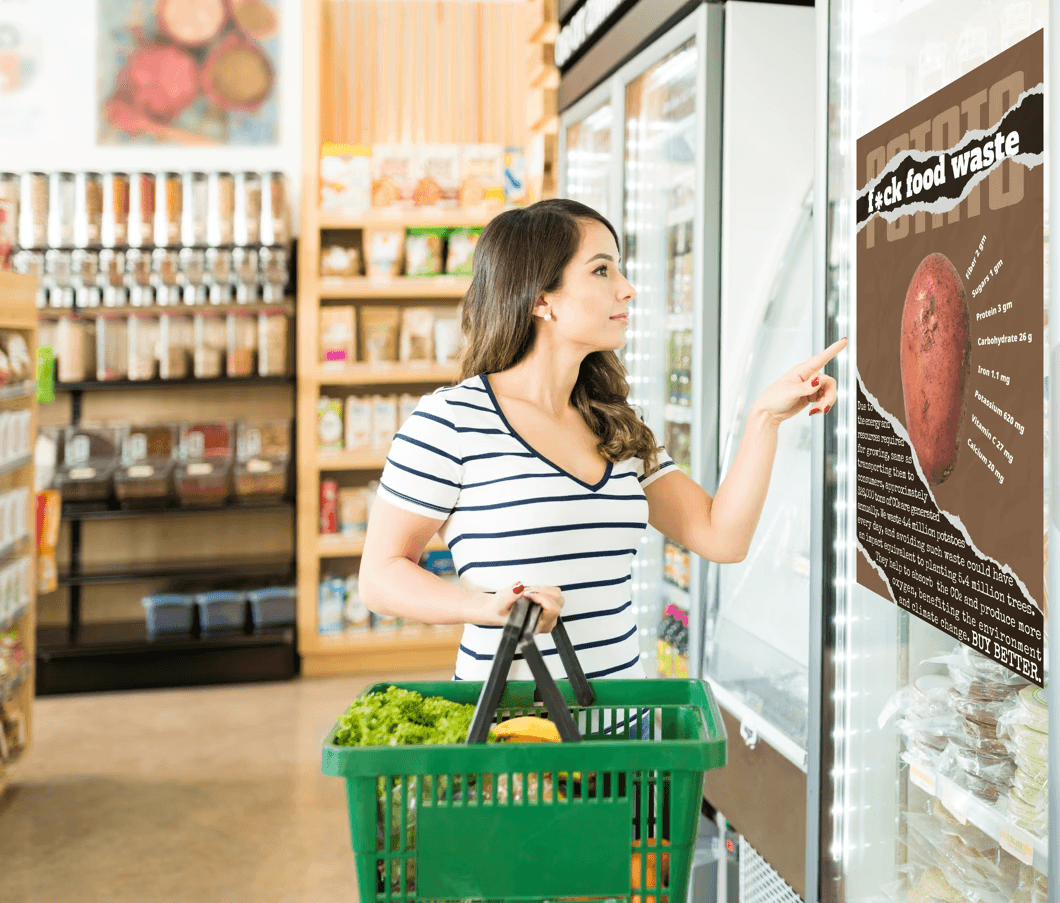
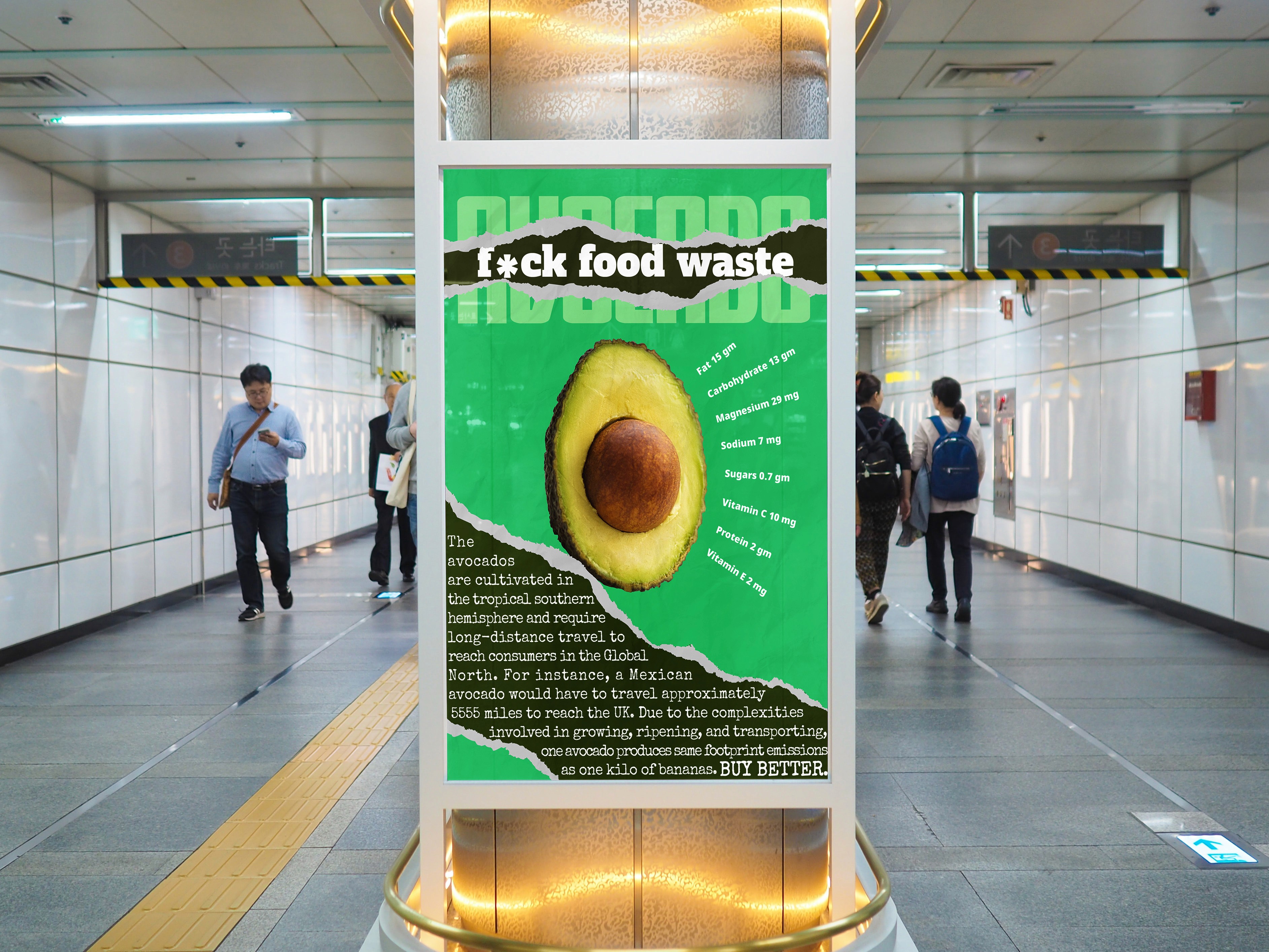
The brief required us to design three posters, a non-traditional touchpoint, and one digital element. We aimed to juxtapose the glossy allure of food advertising with the harsh reality of food waste. Our designs feature a torn paper effect, symbolising the dual nature of consumerism—glamorous on the surface, destructive underneath.
To represent this duality, we chose avocados, milk, and potatoes, common but often wasted products. Each product has a dedicated colour scheme: a Primary Light Colour to represent the beauty and appeal of advertising, and a Secondary Dark Colour contrasting the harsh reality of environmental impact.
Typography was also chosen to convey this message. Gajraj One Regular is used for product titles due to its bold, signage-friendly design, while Alfa Slab One is perfect for headlines, appealing to a broad audience with its contemporary look. Noto Sans Black displays nutritional facts clearly and concisely, and Special Elite Regular has been chosen for its grungy, inked-up feel, representing the dark side of food waste.
Campaign Components
Digital element:
Non-Traditional Touchpoint:
A reusable shopping bag designed for use in supermarkets. The bag features the campaign’s name and a strong anti-waste message, reminding consumers to purchase responsibly.
The impact of this campaign
The "F*ck Food Waste" campaign aims to disrupt the status quo by confronting consumers with the stark realities of their purchasing habits. By leveraging striking visuals and bold messaging, the campaign encourages a shift towards more mindful consumption, ultimately contributing to the reduction of food waste and its associated environmental impact. Through this project, we hope to inspire both consumers and stakeholders to rethink their relationship with food, leading to a more sustainable future.