Richer Sounds is a well-known UK-based home entertainment retailer, operating 51 stores alongside an online shopping platform. As the digital landscape continues to evolve, it became essential for Richer Sounds to enhance the user experience (UX) of their online platforms. The challenge was to improve the website’s usability and design without undergoing a full rebranding, thus retaining the distinctive identity and logo that customers associate with the brand. The redesign needed to streamline the online shopping process, making it more intuitive and user-friendly, especially for first-time buyers.
Optimising User Navigation
The primary goal of the redesign was to reduce the time users spent navigating the website and making purchases. This was achieved by simplifying the shopping process, allowing users to find and purchase products more efficiently. Additionally, the redesign aimed to encourage more online purchases by creating a platform that catered to both seasoned online shoppers and those who traditionally preferred in-store experiences. An important aspect of this project was to enhance the visual presentation of products to counteract the perception that they appeared cheap or of low quality on the previous site. Simplifying navigation was also a key objective, as the original website’s complex layout often overwhelmed users, particularly those who were less tech-savvy. Finally, the redesign sought to provide a self-sufficient online shopping experience, eliminating the need for users to seek assistance from family members or in-store staff.
Research
User Pain Points and Usability Issues
One of the main challenges with the existing website was its cluttered design, which overwhelmed users with an overload of details, making it difficult to navigate. The complex navigation system, with an excessive number of options in the menu bar, further contributed to user frustration, particularly for those unfamiliar with online shopping. Additionally, the visual presentation of products on the site gave the impression of cheap and low-quality items, which detracted from the brand’s reputation for offering high-quality home entertainment products. First-time buyers were especially intimidated by the site’s lack of intuitive access, which made the online shopping experience daunting and difficult to navigate.
Target audience & User Personas
Retired Woman (Senior Citizen)
Someone who has never bought online but is familiar with it, prefers ordering in-store with home delivery, and requires a simplified interface to start shopping online. She also relies on public transport for store visits.
Family Man in His Thirties
A full-time worker with a busy schedule, who prefers to check offers online but often shops in-store due to the website's complexity. He is comfortable with online shopping but finds the current website overwhelming.
Solutions Implemented
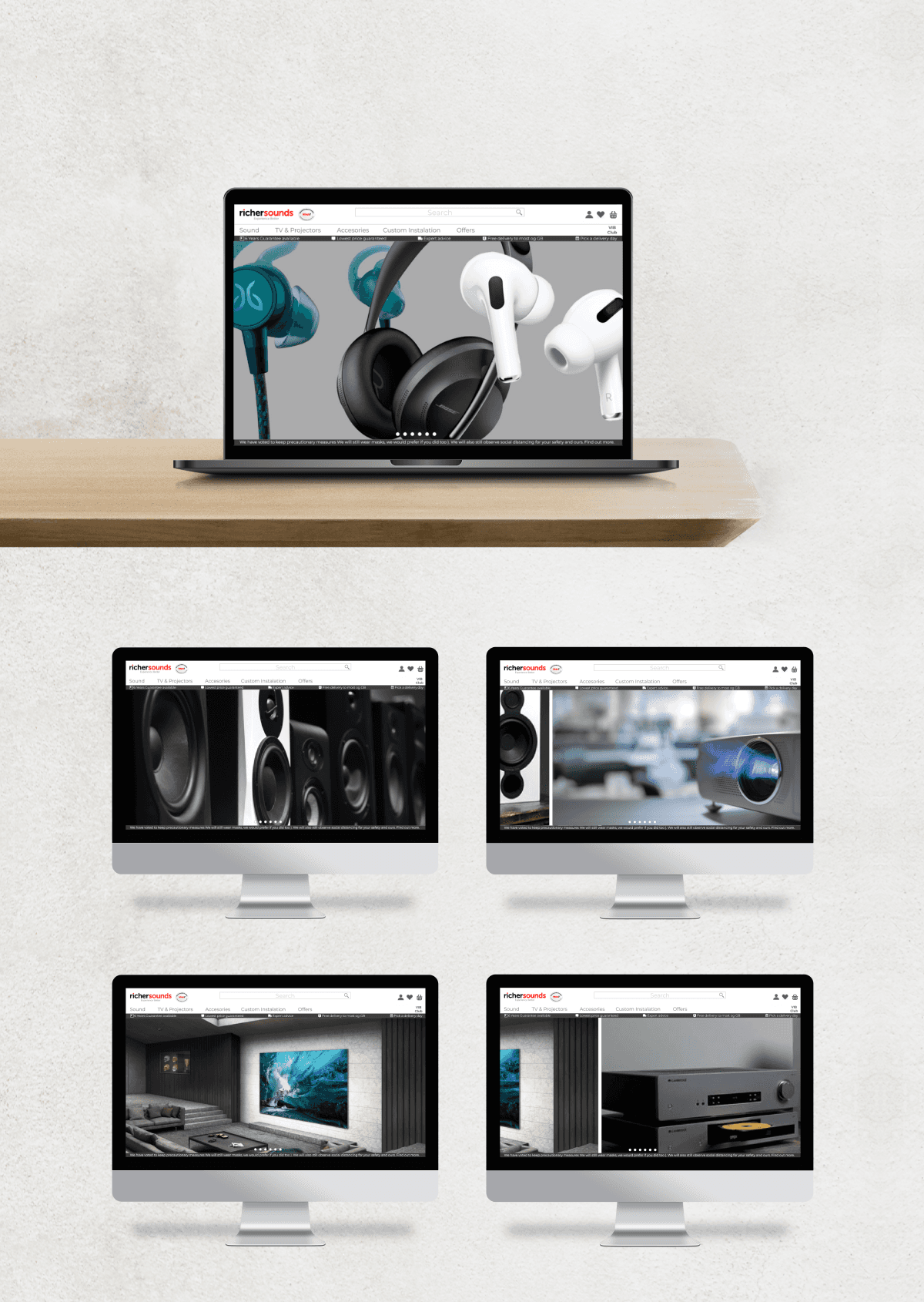
Improved Information Hierarchy: By restructuring the content on the landing page, we prioritised key information, making it easier for users to find what they need without feeling overwhelmed.
Use of Hero Images: We introduced hero images on the landing page to create a more engaging and visually appealing first impression, using images with similar colour palettes to maintain a cohesive look.
Simplified Menu Bar: We reduced the number of options in the menu bar, focusing on the most commonly used categories to streamline navigation.
Enhanced Product Presentation: We focused on improving the visual appeal of products by redesigning the layout and ensuring that images and descriptions highlighted the quality and value of the items.
Design Approach
The solution involved a comprehensive redesign of Richer Sounds’ existing website, focusing on improving the user interface (UI) while adopting a methodical approach to user experience (UX). The design strategy was centred on:
The redesigned Richer Sounds website successfully addresses the key issues identified in the initial assessment. The new layout is more intuitive, reducing the time users spend navigating the site and making purchases. The use of hero images and a streamlined menu bar has significantly improved the visual appeal and usability of the site.
Moreover, the enhanced product presentation has helped to counteract the previous perception of low quality, aligning the online experience with the brand’s reputation for excellence in home entertainment. By focusing on a user-centred design approach, the redesign has not only improved the online shopping journey but also encouraged more users to transition from in-store to online shopping, driving increased engagement and sales through the digital platform.